Website conversion killers that leak pipeline
A B2B SaaS audit of website conversion killers that leak pipeline. Learn how to rank fixes by impact, capture buyer context, and decide when forms are the wrong

Ten thousand visitors land on a B2B SaaS site this month. Three percent book a demo. The other 9,700 leave without a name, a question, or a next step. Most of them were curious. None of them were captured. These are your website conversion killers, and they are not really a UX problem. They are a pipeline leak: anonymous visitors with real intent who never turn into qualified conversations.
The good news is that most of these leaks follow a familiar pattern. Fix the right ones in the right order, and you recover pipeline you probably did not realize you were losing.
Why website conversion killers are really pipeline leaks
The anonymous traffic you never turn into a conversation
Every visitor who lands on your site and leaves without a name is a missed conversation. Not a missed sale. Most of them were not ready to buy today. But they were interested, and interest is the raw material of pipeline. According to research on B2B buying behavior, most B2B buyers do a lot of their research before they ever speak to a vendor. They are on your site, forming an opinion, and then they are gone.
The leak is not that they did not buy. The leak is that you never knew they were there.
Why forms only catch the people already ready to raise their hand
A contact form does one thing well: it captures the visitor who has already decided they want to talk. That is a small group. The larger group, the director who read your pricing page twice, the engineer who opened three feature tabs, has a real question and is not ready to schedule a thirty minute call to get it answered. The form asks for more commitment than their question deserves, so they close the tab instead.
The form is not broken. It is just the wrong tool for anyone still in the figuring it out phase, which is most of your traffic.
Diagnose the website conversion problem before you fix anything
Lead volume, lead quality, or sales efficiency?
These are three different failures, and they need three different fixes.
- Lead volume problem: the site gets traffic but generates almost no demo requests. Messaging, trust, or CTA clarity is broken.
- Lead quality problem: demo requests come in but reps keep saying the leads are not a fit. The site is attracting the wrong audience or failing to qualify before the form.
- Sales efficiency problem: leads are fine, but every first call starts from scratch, with no context on what the prospect cared about. The site captured a name, not a conversation.
Treating all three as "we need more conversions" sends you in the wrong direction.
The quick audit matrix for anonymous-to-known impact
Before fixing anything, score each issue on three axes: how much does fixing this move anonymous visitors to known? Does it improve the quality of what you know about them? Does it give sales better context for the first call?
A broken value proposition scores high on all three. It is why people leave before you ever learn they were there. A misaligned button color scores low on all three. Work the high impact issues first.
A homepage and pricing page example that shows the difference
On a typical SaaS site, the homepage problem is usually messaging. Visitors cannot tell who the product is for or what it actually does in the first ten seconds, so they leave. The fix is clarity, not conversion mechanics.
The pricing page has a different failure. By the time someone gets there, they are interested. The problem is that they have a specific question, does this work for my team size, what is the contract, and there is no way to get it answered without booking a call they are not ready for. The fix there is reducing friction at the moment of highest intent, not rewriting the headline.
Same site. Two different diagnoses. Two different fixes.
Fix the website conversion killers that block qualified conversations
Messaging that says what you do but not why it matters
If a visitor cannot answer "who is this for and what does it solve?" within ten seconds of landing, they leave. Most B2B SaaS homepages describe the product instead of the problem it solves for a specific person. "AI-powered workflow automation" says almost nothing. "The tool that replaces your manual reporting process if you're running RevOps at a mid-market SaaS company" says something.
The fix: name the customer, name the problem, name the outcome, in that order, above the fold.
Trust signals that answer the question behind the question
When a visitor is deciding whether to book a call, the real question is not "does this product work?" It is "is this company worth my time?" Customer logos, specific case study results, security certifications, and named testimonials all answer that question before the visitor has to ask it.
Generic five-star reviews do not move this needle. A testimonial from a named VP of Sales at a company your prospect would recognize does.
Navigation, speed, mobile, and CTA friction in one pass
Google's research on page experience links slow load times directly to bounce rate. A page that takes more than three seconds to load on mobile loses a meaningful share of visitors before they read a word. Beyond speed:
- Navigation that buries the product tour or pricing page makes high-intent visitors work for what they came to find.
- CTAs that say "Get in touch" instead of "See it in action" or "Book a 20-minute demo" force the visitor to guess what happens next.
- Mobile layouts that stack everything vertically and hide the primary CTA below three paragraphs of copy lose people before they scroll.
These are mechanical fixes. Run them once and they stay fixed.
Capture buyer context without making the visitor work for it
When forms are the wrong answer
A blank "Name / Email / Message" form is the wrong ask for a visitor who has a real question and just wants the product to answer it. The form says: "submit a request and we'll get back to you." That is fine for someone ready to enter a sales process. It is the wrong motion for someone who wants to know whether your product handles a specific integration before they decide if a call is worth their time.
What to use instead of a blank contact field
Three alternatives that capture intent without killing momentum:
- Chat-based capture. A conversational widget asks what the visitor is trying to solve, answers their question, and qualifies them in the same flow. No form, no wait.
- Quiz or assessment flow. "What's your team size and primary use case?" takes thirty seconds and gives you more signal than a blank email field. Visitors who complete it are more qualified, and you know why before the call.
- Progressive profiling. Collect one piece of context at a time as the visitor engages: role on the first interaction, use case on the second, company size when they hit pricing. Spread the ask across the session instead of front-loading it.
The goal is to lower the barrier at the moment of highest intent, not to collect a complete profile before you have earned it.
How to hand sales context instead of a name and email
Good handoff data looks like this: the visitor's role, the use case they mentioned, the features they clicked on, the question they asked that nobody answered, and whether they hit the pricing page. A rep who walks into a call with that information can skip the first ten minutes of "tell me about your current process" and get to the thing the buyer actually cares about.
A name and an email hand the rep a cold call with a warm lead attached. The context is what makes the call worth taking.
Rank the fixes by impact when dev time is limited
Start with the change that affects the most anonymous visitors
Prioritize by reach first. A broken value proposition affects every visitor who lands on the homepage, which is usually the highest traffic page. A missing trust signal on the pricing page affects a smaller but higher intent group. Fix the homepage messaging before you optimize the pricing page layout.
The instinct is to fix the thing that looks most broken to the team. The better move is to fix the thing that is blocking the most buyers.
Use the matrix to compare effort against pipeline impact
Low effort, high impact fixes go first. Rewriting the homepage headline is a half day job. Adding customer logos is an afternoon. Both have high reach and high anonymous to known impact. A full site redesign is a quarter of engineering time and may not move the needle more than the headline did.
Run the matrix: reach × qualification impact × sales-context impact ÷ implementation effort. The top of that list is your sprint backlog.
The fixes that usually move first on a SaaS site
In rough order for most B2B SaaS sites:
- Value proposition clarity — homepage, above the fold
- Trust signals — logos, testimonials, security cues
- CTA language and placement — specific ask, visible location
- Page speed — especially mobile
- Mobile layout — CTA accessible without scrolling
- Capture flow — replace or augment the blank form
Deeper changes, pricing page restructure, qualification flow, sales handoff tooling, come after you have confirmed the core message is working. Do not rebuild the capture flow if visitors are leaving because they do not understand what you do.
A simple website conversion audit you can run this week
The five minute homepage test
Land on your homepage as a first-time visitor with no prior context. Set a ten second timer. Ask: do I know who this is for? Do I know what problem it solves? Is there a clear next step? Is the page usable on a phone?
If you cannot answer all four in ten seconds, you have found your first leak.
The pricing page check for high consideration SaaS
Open your pricing page and look for unanswered buying questions. Does the page tell a visitor what happens after they sign up? Does it answer the "does this work for my team size" question? Is there a way to ask a question without booking a full demo call?
The pricing page is where intent peaks. It is also where most sites add friction instead of removing it.
The one page scorecard that shows where pipeline leaks start
Score each item 1–3 (1 = broken, 2 = okay, 3 = working):
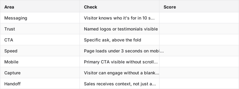
Anything scoring 1 is a leak. Fix in order of reach.
Where Inkly comes in
The structural problem this audit keeps surfacing is the same one: the site captures the visitors who were already going to raise their hand, and does nothing for the larger group still deciding. A form and a "book a demo" button are the right tools for the ready few. They are the wrong tools for the visitor who read your pricing page twice at 11pm, had one question, and found no way to get it answered without committing to a calendar invite.
Inkly is an AI demo agent built on the premise that the site itself should do the qualification work, not just hold a form until a rep follows up. It opens a conversation with the visitor, learns what they are trying to solve, runs a live interactive walkthrough of the product tailored to their use case, answers the question that was about to make them close the tab, and hands sales the full context: what they explored, what they asked, what they still need to see. The rep does not start from zero. The visitor does not leave with an unanswered question.
If your audit keeps pointing at the gap between "traffic with intent" and "conversations with context," that is the gap Inkly is built to close. Turn that anonymous traffic into qualified pipeline.
FAQ
Q: Which website conversion killers most directly prevent anonymous B2B visitors from becoming qualified sales conversations?
Weak value proposition messaging is the biggest single blocker. If visitors cannot tell who the product is for and what it solves in ten seconds, they leave before any capture mechanism gets a chance. After that: missing trust signals, no logos, no testimonials, no proof, CTAs that ask for more commitment than the visitor's intent level supports, slow page load on mobile, and forms that require a full meeting request to answer a simple question. These stack. A visitor who survives weak messaging still bounces if the form asks for too much.
Q: How do you diagnose whether the real problem is messaging, trust, navigation, speed, or CTA friction on a SaaS site?
Each failure shows up differently. Messaging problems appear as high bounce rates on the homepage with low time on page. Visitors are not staying long enough to reach any CTA. Trust problems appear as visitors reaching the pricing or demo page and then leaving without converting. Intent was there, confidence was not. Navigation problems show up as low click through from the homepage to product or pricing pages. Speed and mobile problems show up in mobile specific bounce rates. CTA friction shows up as visitors reaching the CTA and not clicking. The ask is wrong for where they are in the decision.
Q: What should replace or augment forms and CTA buttons if you want more context before a sales call?
Chat-based capture lets visitors ask their actual question and get an answer in the moment, no wait, no calendar. Quiz or assessment flows ("what's your use case and team size?") collect qualification signal in thirty seconds and give you more to work with than a blank email field. Progressive profiling spreads the data collection across the session instead of front-loading it at the point of highest friction. Any of these beats a blank "Name / Email / Message" form for visitors who are still deciding.
Q: How do you capture enough buyer intent without creating more friction for high-intent visitors?
Ask less at the moment of highest intent, then collect context as the conversation progresses. A high-intent visitor on the pricing page does not want to fill out a five-field form. They want their question answered. Start with one low-commitment ask, what are you trying to solve, answer the question, and collect the rest progressively. The friction you add at peak intent is the friction that loses the deal.
Q: What trust signals matter most when the goal is not ecommerce purchase but booked meetings and pipeline quality?
Named customer logos from companies your prospect would recognize. Specific testimonials that name a role and an outcome, "reduced our onboarding time by 40%" from a named VP of Customer Success beats a generic five-star review. Security certifications visible before the visitor has to ask. Case studies that describe a problem similar to the visitor's own. The question behind the question is always "is this company worth my time?" and generic social proof does not answer it the way a named peer does.
Conclusion
The pipeline leak is not mysterious. Most of your traffic arrives with intent and leaves anonymous because the site was built to serve the ready few, the visitors who already decided, and has nothing for the larger group still deciding. Run the audit this week. Score each area by reach and impact. Fix the value proposition first if it is broken, then trust, then the capture flow. The goal is not more clicks. It is more anonymous visitors becoming qualified conversations with enough context that the first sales call is worth having.
Let visitors start this themselves, any time, with the website demo agent.
Ship your next demo before the meeting starts
Interactive demos built from your real product and kept current as you ship, done for you.


