Product tour examples that fit your activation goal
Product tour examples mapped to activation goals, product complexity, and build surface, so you can pick the right format, write the copy, and measure whether i

Every product tour starts with a honeymoon. You wire up the tooltips, the modal pops on login, the checklist ticks down, and for a week the flow looks exactly like the activation goal you sketched on a whiteboard. Then the UI shifts. A button moves. A step that used to take thirty seconds now takes three clicks. The tour keeps pointing at the old screen, and users bounce right when you thought they would convert.
The question is not which product tour examples look best in a Dribbble screenshot. It is which format fits your activation goal, how much copy each step needs, and what the maintenance cost looks like after the next release. Here is a practical map.
Pick the product tour format that matches the job
Not every activation problem needs the same solution. The format you pick decides whether users finish the tour or click out of it in frustration.
Tooltip sequence vs checklist vs modal vs sandbox
A tooltip sequence works when the user needs to find one thing in an existing interface: a single feature, a single field, a single action. It is ambient. The user is already in the product, and the tooltip is a nudge, not a gate.
A checklist works when activation needs several separate actions that do not have to happen in order. It gives people a sense of progress without forcing a linear path. PostHog's research on uncovering user problems notes that users respond best to guidance delivered shortly after they have completed a key onboarding action, and the checklist format fits that timing well.
A modal works for announcements, permission requests, or one decision the user has to make before they can continue. It is a gate, which means it only makes sense when the decision is actually required.
A sandbox works when the user has to do real work to understand the product, not click through a story. They need to configure something, run a query, or complete a multi-step workflow.
A driven-action flow, where the product walks the user through an actual task in the live product, works for high-friction workflows where watching is not enough. The user has to do the thing to understand it.
Which activation goal each format actually serves
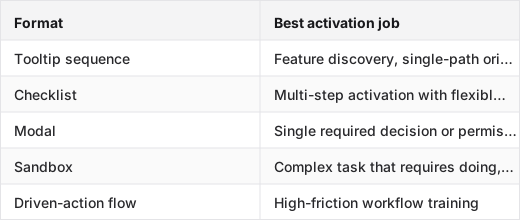
Video pointers and product walkthroughs look polished, but they rarely move users forward on their own. They are passive, and passive does not activate. Use them as a supplement to an interactive format, not as the main tour.
The simple filter: if a user can reach your activation milestone by following one path and doing one action, a tooltip sequence or short modal is enough. If they have to configure something real, build something real, or understand a multi-step dependency, go sandbox or driven-action.
Use product tour examples for simple workflows only when the user can finish fast
Guided product tours for simple workflows have one job: get out of the way fast enough that the user reaches the value moment before they lose interest.
The three-step tour that gets out of the way
The best simple-workflow tour has a first screen that explains why the tour exists, a middle step that shows the one action, and a completion state that confirms success. Three steps is a ceiling, not a target. If the workflow has one action, the tour has one step.
A short tooltip sequence for a simple workflow might look like: "Here is where your data lives -> click Import -> you are set." The user did the thing. The tour is done.
Why overexplaining a simple flow kills completion
Every extra step is a tax. Users do not read tooltip copy the way you wrote it. They skim, they click, they look for the exit. A five-step tour for a two-step workflow tells people the product is more complicated than it is, and they bail before they find out it is not.
The failure mode is usually a founder who knows the product too well. They add a step to explain the context behind the action, then a step to explain what happens after the action, then a step to point at a secondary feature that is "worth knowing about." The user opened the product to do one thing. Now they are in a guided tour of the founder's mental model.
A short guided tour copy pattern that does not ramble
First screen: one sentence on why this tour exists, one sentence on what the user will be able to do when it is done. No product history, no feature list.
Middle steps: one action per step, written in the imperative. "Click Import." "Name your project." "Select your first data source." Not "You can now click the Import button, which will allow you to begin the process of..."
Completion state: confirm the action happened, then name the next thing the user should do. "Your first import is running. Head to the dashboard to see it land."
Product tour examples for complex workflows need more than tooltips
When the workflow has real dependencies, setup, integration, multi-step configuration, a tooltip sequence is the wrong tool. Interactive tours for complex workflows have to let the user actually do the work.
When a sandbox beats a narrated walkthrough
A sandbox gives the user a safe place to make real decisions without real consequences. For a complex product, that is the difference between understanding and just watching someone else understand.
A narrated walkthrough, whether it is a video, a click-through tour, or a linear modal sequence, tells the user what the workflow looks like. The sandbox lets them find out what it feels like to do it wrong, correct it, and finish. That is the kind of learning that produces activation.
Vercel's approach to interactive product documentation points in the same direction: complex developer workflows benefit from hands-on exploration rather than passive walkthroughs, because the user has to understand the system, not just the steps.
The messy setup path you should not hide
The instinct with complex workflows is to simplify the tour until it looks easy. That is backwards. If setup needs three integrations and a configuration step that takes judgment, the tour should walk through that honestly, with the sandbox showing what a correct configuration looks like and what a broken one looks like.
Hide the complexity and the user runs into it the first time they are on their own. They think they did something wrong. They churn.
How to keep a complex tour interactive without making it long
Let the user act at every step. The tour should respond to what they do: confirm a correct action, flag an incorrect one, advance when the step is complete. That is different from a linear click-through where the "interaction" is just clicking Next.
Keep each step to one decision. If the user has to make two decisions to complete a step, split it. The tour feels shorter when each step has a clear finish, even if there are more of them.
Write the first screen, middle steps, and completion state like they matter
Product tours are copy problems as much as UX problems. The words in each state decide whether the user understands what to do and why it matters.
What the first screen has to say
Three things, in order: why this tour exists, what the user will be able to do when it is done, and how to leave if they already know what they are doing. The exit option is not a concession. It is a signal that the tour respects the user's time.
Why the middle steps should be thinner than you think
Each middle step has one job: get the user to do the action. The copy should name the action, not explain the product. "Connect your first data source" is better than "Data sources are the foundation of your workspace. You can connect up to 10 data sources on the free tier. To get started, click the Connect button in the top right."
The user is not reading for art. They are reading to find out what to click.
The completion state is part of the tour, not a footer
The completion screen should confirm success, point to the next action, and make the exit feel intentional. "Your first report is ready" and "Head to Insights to explore it" do more work than "You're all set!" followed by a hard stop. Otherwise the user does not know what just happened or what to do next.
Measure product tour examples by completion, skip, and activation
A tour you cannot instrument is a tour you cannot improve. Tracking completion and skip rates is table stakes. The metric that actually matters is whether people who finish the tour activate at a higher rate than people who skip it.
What to track before you trust the tour
Four events, minimum: `tour_started`, `step_completed` (with step index), `tour_skipped` (with step index), `tour_finished`. Without these, you do not know where users drop off. You just know the tour exists.
Add a `tour_cta_clicked` event on the completion state if the final screen points to a next action. That event tells you whether the completion state is doing its job.
The event-tracking table that separates signal from noise
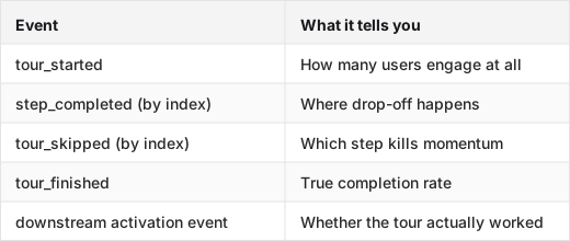
The downstream activation event is the one most teams skip. Connect tour completion to whatever your product defines as activated: first report created, first integration connected, first message sent. If completers do not activate at a higher rate than skippers, the tour is not the problem and it is not the solution.
When a high completion rate still means the tour failed
If 80% of users finish the tour and 20% activate, the tour is not working. High completion means the copy was smooth and the steps were short enough to finish. It does not mean the user understood the value.
The fix is usually the completion state and the step right before it. Either the final action is not connected to the value moment, or the value moment is not named clearly enough for the user to recognize it when it happens.
Personalize product tour examples by role, skill, and segment
A first-time user and a power user imported from a legacy system should not see the same tour. Neither should a founder and an admin, even if they land in the same product.
Role-based tours are not the same as one-size-fits-all onboarding
The failure mode of a generic tour is that it is too basic for experienced users, who skip it, and too fast for new users, who get lost after it ends. Role-based segmentation fixes both: experienced users get a shorter, feature-discovery-focused tour; new users get the full activation path.
The segmentation signal can be simple: a question on signup ("I'm new to this category" vs "I've used similar tools"), a role field, or behavioral data from the first session.
How to keep the same tour skeleton and swap the details
You do not need to rebuild the tour for each segment. Keep the step structure, the event tracking, and the completion state identical. Swap the copy, the examples, and the specific action in each step. A power-user version of "Connect your first data source" might skip the explanation entirely and go straight to the advanced configuration option. A new-user version walks through the default.
This is the same pattern Stripe uses for product education — the same workflow, surfaced differently depending on what the user already knows.
The exit option has to change with the user's confidence
For a new user, the skip button should be there but not loud. They probably need the tour even if they think they do not. For a power user or an experienced import, the skip should be the first thing they see. Making an experienced user click through a tour they do not need is a faster path to churn than no tour at all.
When the tour covers a workflow the user must complete to use the product at all, like account setup, billing, or a required integration, make it mandatory. When it is guidance for a feature they can find on their own, make it skippable.
Pick the trigger that matches the job, not the one that sounds clever
First login for the first win
A first login trigger works when the user has exactly one job: get to their first activation milestone. New trial signup, clean account, no existing data. The walkthrough starts immediately and runs the shortest path to the first win.
It creates noise when the user already has context, like a teammate inviting them into an existing account, they've seen a demo, they know where they're going. Triggering a first login walkthrough on a user who just needs to find one specific feature is the fastest way to get it dismissed.
Event based triggers for real behavior
Event based triggers fire after a user does something specific: opened the report builder for the first time, added a second team member, reached the usage threshold that unlocks a feature. The walkthrough starts because the behavior happened, not because the session started.
Product analytics platforms like PostHog make this event logic straightforward: capture the action as an event, use it as the trigger condition. The result is a walkthrough that appears exactly when the user needs it, not one minute before or after.
Role based starts for different jobs
Admins and end users land in the same product with different jobs. An admin needs to configure settings before inviting the team. An end user needs to reach their first activation milestone. The same walkthrough trigger fails both.
Role based triggers fire a different walkthrough variant depending on what the user is there to do. The trigger is the same event, first login or first visit to a section, but the walkthrough that runs branches immediately based on role or plan. Same product, different job, different path.
Break down interactive product walkthrough examples into seven screen types
The welcome moment
The first screen sets context without overexplaining. One line on what the user is about to do, not what the product is. "Let's get your first report set up — takes about two minutes" beats a paragraph on the company mission.
The welcome moment earns its place only when the user lands cold, from an email invite, a trial signup, or a direct share link. If the user is already in the app and clicked something, skip the welcome and go straight to the guided action. The trigger decides whether this screen appears at all.
The guided action screen
This is the core of the walkthrough. The user clicks something, types something, or confirms something, and the walkthrough is there for it. It is not there to explain the UI around the action. It is there for the action itself.
Weak guided action screens describe what the button does. Strong ones say "click this to create your first report" and then get out of the way. The tooltip copy is one sentence. The target is one element. The next step appears only after the action completes.
Userpilot's onboarding documentation draws the same line: a step that explains is not the same as a step that guides. The guided action screen is where the user does the work. It is not a lecture.
The proof point screen
After the action, the user needs to see that something happened. This is the proof point screen: a confirmation state, a populated dashboard, a result that makes the action feel real.
A weak proof screen shows a success toast and immediately advances to the next step. A strong one pauses on the result: "here's the report you just created" and lets the user feel the progress before moving on. The pause is the proof. Skipping it is the most common reason walkthroughs feel hollow even when the activation rate looks fine.
Cut the steps that add friction without changing conversion
The dead steps nobody needs
Steps that explain obvious UI cost completion rate without adding activation. "This is your dashboard" is not a step. It is a caption. "Click the blue button to continue" is not a step if the blue button is the only clickable thing on the screen.
Every dead step is a skip. Every skip trains the user to dismiss the walkthrough faster. Keep one dead step and you lose the next three real ones.
Where walkthroughs get too long
Completion drops sharply after five steps in most self serve SaaS flows. Not because users give up, but because by step six the walkthrough has usually left the activation path and started touring features the user did not ask about.
A walkthrough that covers the report builder, the dashboard, the settings page, and the integration panel in one flow is four walkthroughs badly combined. Split them. Trigger each one at the moment the user needs it, not all at once on first login.
What to remove before launch
Before any walkthrough goes live, cut these:
- Steps that describe UI the user can see without help
- Steps that repeat information from the previous step
- Welcome screens triggered for users who already have context
- Proof point screens that advance automatically without letting the user see the result
- CTAs that point to a company goal instead of the user's next job
Where Inkly comes in
The structural problem with most product tours is not the format. It is that the tour is a separate artifact from the product. When the UI changes, the tour does not know. You recapture the screens, re-annotate the steps, re-test the flow. That cycle adds up every release.
The format that avoids this depends less on a fixed set of captured screens. A live walkthrough, where something guides the visitor through the product and answers what they ask, does not hinge on a recording of the old interface. That is the difference between a tour that stays current and one that shows users the old interface on the day you are trying to close them.
Inkly is the AI demo agent that turns website visitors into buyers. It does not build a tour out of tooltips. It asks each visitor their role and goal, guides them through the product live, and answers questions in context, which suits prospects who have not signed up yet. It is not in-app onboarding, so the tooltip, checklist and driven-action formats above are still the tools for people already inside your product. How it works walks through the stages.
FAQ
Q: Which product tour format should I use for my activation goal: tooltip sequence, checklist, modal, video pointer, sandbox, or driven-action flow?
Match the format to the complexity of the activation job. Tooltip sequences and checklists work when the user needs light orientation, like a single feature or a flexible multi-step path. Modals work for one required decision. When the user has to do real work to understand the product, like configure something, run something, or connect something, use a sandbox or driven-action flow. Video pointers are passive and rarely activate users on their own, so treat them as supplements, not primary formats.
Q: What does a good product tour example look like for a simple workflow versus a complex workflow?
A simple-workflow tour has three steps or fewer, each step names one action, and the completion state points to the next thing. It gets out of the way fast. A complex-workflow tour lets the user actually do the work in a sandbox or driven-action flow rather than watching a narrated sequence. The key difference is simple workflows need guidance; complex workflows need practice. A tooltip sequence on a complex workflow leaves the user lost the moment the tour ends.
Q: How many steps should a tour have before completion rates start dropping?
The number of steps matters less than how much work each step asks for. A seven-step tour where every step is one click will outperform a three-step tour where each step requires reading a paragraph and making a judgment call. The practical ceiling for most activation tours is five to seven steps. Beyond that, users start treating the tour as an obstacle rather than a guide. If you are over that, check whether any step is doing two jobs and split it, or cut the step entirely.
Q: How do I personalize a tour for different roles, experience levels, or user segments?
Keep the step structure and event tracking identical across segments. Swap the copy, the examples, and the specific action in each step based on the segment signal: a signup question, a role field, or first-session behavior. The simplest rule is this: experienced users get a shorter tour focused on what is new or non-obvious; new users get the full activation path. Do not rebuild the tour from scratch per segment. Keep one skeleton and swap the details.
Q: When should a tour be skippable, and when should it be mandatory?
Make it mandatory only when the tour covers a workflow the user must complete to use the product, like account setup, a required integration, or billing. Everything else should be skippable, and the skip button should be easy to find. For experienced users or imports from another tool, the skip should be the first thing they see. Forcing a capable user through a tour they do not need signals that the product does not trust them, and that is a faster path to churn than no tour at all.
Conclusion
Pick the format that fits the activation job, not the one that looks best in a screenshot. A tooltip sequence for a simple workflow, a sandbox for a complex one, and a completion state that points somewhere useful. Instrument skip, completion, and downstream activation before you trust any of it. Run one live flow this week with real event tracking and see whether tour completers actually activate at a higher rate than users who skipped. If they do not, the format is not the problem. The copy or the value moment is. A tour is only useful if users finish the right action, and it only stays useful if the maintenance cost is low enough to keep it current after the next release.
Want to see the steps behind an agent-led demo? Here is how Inkly works, stage by stage.
Ship your next demo before the meeting starts
Interactive demos built from your real product and kept current as you ship, done for you.


